At gaitQ®, usability and accessibility are at the heart of our user experience (UX) design process. You may be asking what the difference is between these two terms: usability refers to how easy a product is to use in a general sense, while accessibility focuses on making the product usable by as many people as possible, including those with a disability.
Challenges in accessible design
While usability is becoming more of a priority for UX design, accessibility is sometimes overlooked. It’s easy to think that a product with a complex user interface, such as a smartphone, may be difficult to make accessible. However, simple products with a basic user interface pose a harder design challenge due to their much more limited information output methods. For example, a UX designer can use audio, vibrations or screen adaptations to make a smartphone more accessible. Creating a good solution can be a significant challenge if only a single indicator light is used to display all information to the user.
Accessibility and gaitQ tempo
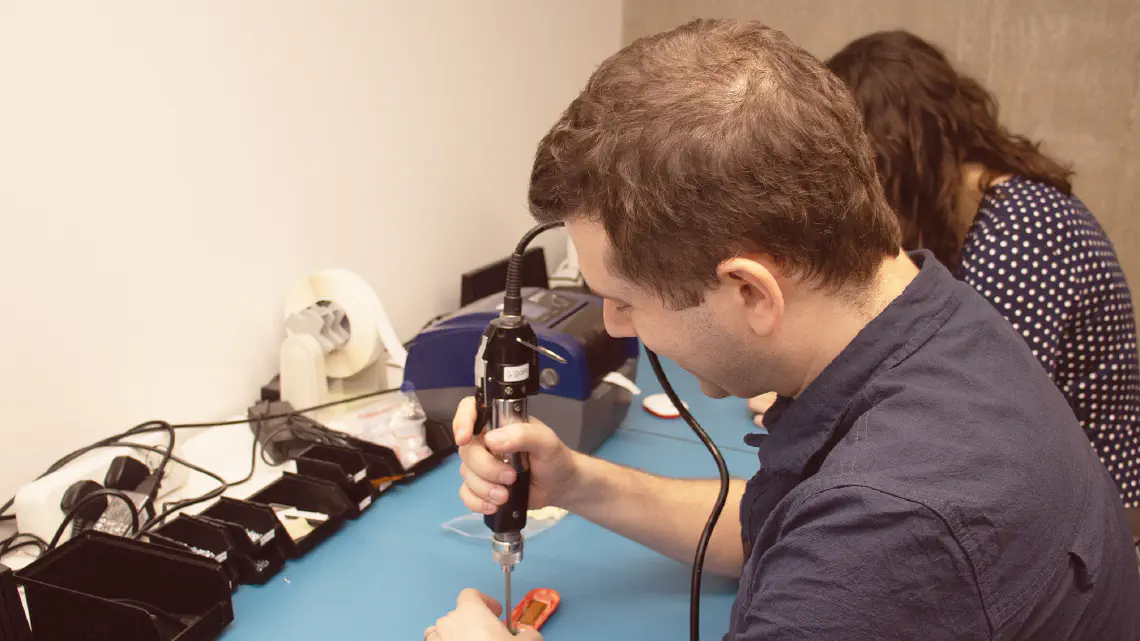
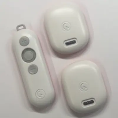
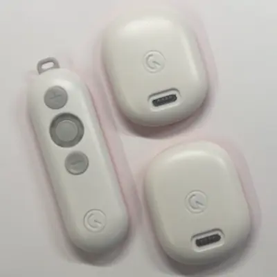
Our new product, gaitQ tempo™, uses indicator lights to communicate with the user. The product consists of multiple units, each with their own lights: a light ring on the Controller and single lights on each of the Pods. Based on user feedback we found that the lights were confusing and difficult to understand. We have therefore invested further time into improving the accessibility of the interface of all of the units, paying particular attention for those with cognitive impairments and colour vision deficiencies (commonly known as colour blindness).
Reducing cognitive load
An estimated 25% of people with Parkinson’s have mild cognitive impairment, so reducing cognitive load is highly relevant for our product. When we performed a review of the interface we found that some of the information that we were conveying was unnecessary - if there is nothing that the user can do about it, there’s no point showing it! Therefore, to reduce cognitive load, we have simplified the interface design to display as little information to the user as possible without compromising usability. This means that the user has fewer light patterns / colours to remember and the behaviour is more intuitive. This work to improve accessibility does not only relate to the physical design, it is also applicable to the instructions for use, which we’ll explore in a later blog post.
Designing for colour vision deficiency
Colour vision deficiency (CVD) covers a wide range of conditions and is estimated to affect more than 3 million people in the UK alone. In fact, one of our firmware engineers, who has a form of CVD, had difficulties figuring out what state some of our early prototypes were in due to poor accessibility! We’ve refined the user interface using two methods to improve this:
We’ve selected colours that are distinguishable for as many deficiencies as possible. This alone is sufficient for the majority of types of CVD but does not help those with a rare type of CVD that means that they cannot distinguish any colours at all. This is why we use a second method…
We’ve ensured that each piece of information that we which to convey, uses a different ‘pattern’ in addition to colour, so that the user doesn’t have to rely on colour alone to distinguish between them.
Redesign of battery level indicators
As an example, the two short animations below show how the battery level was communicated before and after the redesign. The original behaviour used three colours to indicate the battery level, all with the same pattern.
UX before
After the redesign, we only show two states: OK battery, and low battery; each with their own pattern and colour. The effect of these changes? We have reduced cognitive load by minimising the number of states presented to the user, and improved accessibility for those with CVD by using distinct patterns.
UX after
Accessibility is fundamental to our user-centric design process at gaitQ®. We encourage all designers to consider as broad a range of users as possible, guiding their work by research and, most importantly, user consultation.